How to Design a Logo: A Business Logo Checklist of 2026

Designing a logo can feel hard at some point. But it shouldn’t be. A clear process, a business logo checklist, removes the anxiety of bed branding. You can create a logo that feels right for the brand if you know the design thinking process. As a designer, I will walk you through each step of how to design a logo. I promise, I will be quick.
Why a Logo Matters
At this point, you might be thinking, every business has a logo, I should have one too. It’s just one of those things you just need, right? But a logo has a significant impact on your business growth. So you need to start thnking about it before you build your business website.
A logo creates first contact with your brand. People see it before they read anything else. Some logos stick in memory for years. The Apple symbol, the Nike swoosh, and the McDonald’s arches prove that point.
A logo appears in many places. Websites, emails, packaging, social profiles, and printed material all rely on it. The design must stay clear in every size and format. That’s the mental model you need to set. With that, keep reading.
Define the Brand Before Designing
I used open software before I started thinking. That killed a lot of valuable time and led to weak results. A logo reflects the brand, not personal taste. So, start with clear answers.
- What does the business sell or offer? Write one sentence. Keep it concrete.
- Who buys from you? Age, role, and expectations shape design choices.
- What personality fits the brand? Pick three to five traits. Write them down.
- What values guide the business? Trust, speed, care, or creativity often show through visual style.
Use a notebook. Keep the notes simple. These notes guide me through every choice later in my work process.
Collect Visual Inspiration
Look around before drawing. Well, not literally, but explore the market. What’s your niche, and how do you want your customer to identify you? Study strong work. Learn patterns. Avoid copying.
Browse design galleries like Behance, Dribbble, LogoLounge, or something similar. Save what stands out. Ask why it works for your brand. Yes, telling you to talk to yourself.
Review logos from direct competitors. Note shared colors, shapes, and layouts. Decide where to match the category and where to differ. It will depend on your customer persona. So research that too.
Look outside logo design, something that not your niche directly. Observe architecture, posters, books, and fabric patterns. Anything can spark ideas. Gather images in one place. A single board helps maintain visual focus. The industry calls it the moodboard.
This systematic inspiration will spark ideas. Copying weakens trust. So, let’s understand the basics. Before we get into the Business Logo Checklist.
Know the Main Logo Types
Every logo fits into a broad group. Each group solves a different problem. You need to be sure which will fit best and will be timeless for your niche.

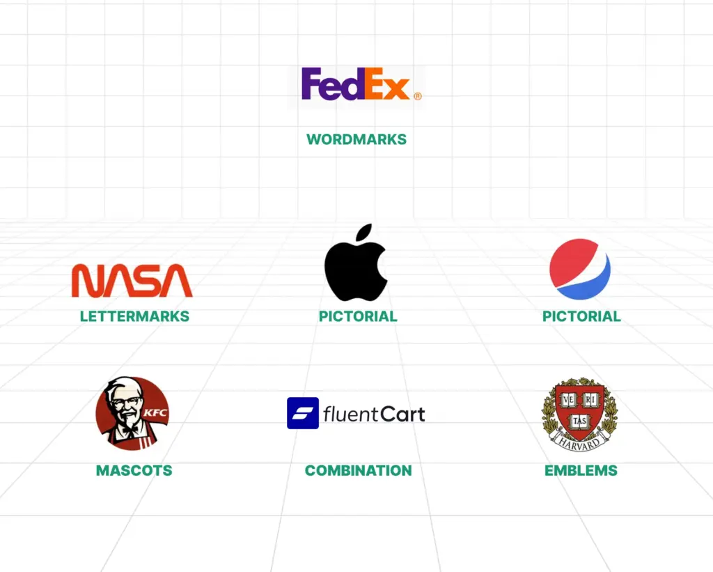
Wordmarks rely on the business name alone. Google and Coca-Cola use this style. It works well for clear and short names.
Lettermarks use initials. IBM and NASA follow this route. This style suits long names.
Pictorial marks use a recognizable image. Apple and Twitter fit here. Simplicity matters most in this group.
Abstract marks use shapes with no literal meaning. Pepsi and Airbnb use this form. This style allows broad interpretation.
Mascots rely on illustrated characters. KFC and Michelin show how this builds warmth and familiarity.
Combination marks mix text with a symbol. Burger King and Lacoste use this layout. Flexibility remains the main benefit.
Emblems place text inside a badge or seal. Starbucks and many universities follow this style. These feel formal and established.
Choose the type that matches your goals, not only your current goal, but also your future goals.
Business Logo Checklist
These are more of a process steps of a how to design a logo, instead of a good to maintain checklist.
Choose Colors With Purpose
Color affects emotion. Your niche’s customer personal carry a particular emotion. This emotion comes from the porblem there facing, for which the solution you are providing. Each hue sends a signal.
- Red suggests energy and urgency. Many food brands use it.
- Blue signals trust and calm. Banks and tech firms favor it.
- Yellow feels friendly and warm. Careful use avoids visual strain.
- Green links to growth and nature. Health and finance brands use it often.
- Orange feels playful and active. It draws attention without aggression.
- Purple signals creativity and luxury. Fewer brands use it, which helps separation.
- Black feels strong and refined. Luxury brands rely on it.
- Pink feels modern and expressive. Many new brands use it boldly.
- Brown feels earthy and honest. Coffee and outdoor brands use it well.
Start with one or two main colors. Test them on screens and paper. And think what you customer personal will prefer the most. And never ever forgot to check grayscale versions. The grayscale version gives a color neutral prespective.
Pick the Right Typeface
Type choice shapes perception. It shows whether the brand feels fun, serious, or creative. The typeface sets the tone and helps people understand the brand at a glance.
- Serif fonts include small strokes. They feel classic and reliable.
- Sans-serif fonts feel clean and modern. Tech brands favor them.
- Script fonts mimic handwriting. Use them with care and test legibility.
- Display fonts draw attention. Use them sparingly.
Readability comes first. Test the logo at small sizes. If you are using two fonts then font pairing needs balance. Usually, in a logo, two fonts are never recommended. But if you need then be careful.
Adjust spacing between letters. In technical design terms, it is called kerning. Avoid novelty fonts that appear dated or childish, like Comic Sans, unless that’s what your goal is.
Sketch Before Using Software
Now wait, I am not saying you have to be a seasoned artist to mark this logo checklist. Just random doodling is good to go. Start on paper. Fast sketches reveal ideas quickly. Draw many small versions. Aim for twenty or more. Keep your ideas simple.
Focus on shapes and balance. Ignore details at this stage. Pick three to five strong sketches. Redraw them slightly bigger with clean lines. But again, do not use any fine details. No logo needs it.
Negative space adds clarity, if you can put any claver rbad direction in it. FedEx and Amazon show strong examples if claver user negative space. Remove extra elements. Simpler designs last longer. You need a timeless design, not trendy once.
Create Digital Versions
Now you have a clear idea of what you want. Move to software. Vector tools work best. They scale without quality loss.
- Adobe Illustrator offers full control and precision.
- Affinity Designer provides similar tools, and it’s 100% free.
- CorelDRAW remains popular in print workflows.
Online tools help beginners or non-designers.
- Canva offers templates and ease of use. Repetition limits uniqueness.
- Figma supports vector design and collaboration.
- LogoMakr and Hatchful offer quick results with limited control.
- Paid tools like Looka and Tailor Brands create fast drafts. Custom detail remains limited.
A vital thing to remember is to use vectors whenever, because scalability matters. Next in the logo checklist is checking for real life.
Build Variations and Mockups
Strong logos adapt to context. Create a main version in color. Create stacked and horizontal layouts. Prepare an icon-only or monogram version. Create black, white, and grayscale versions.
Whenever you use a monogram and type combo, you can use three grid rule to create a proper ratio for more visual balance. You need to understand that designing is doing math.
Test on light and dark backgrounds. Place the logo on mockups. Business cards, websites, packaging, and signage reveal issues early.
Test With Real People
Distance and fresh or new eyes improve judgment. Blur or squint your eyes. If the shape stays clear, then you did a great job. Shrink the logo to a 16px by 16px size. Small sizes expose weak details.
Even if you remove the colors, the structure should remain strong. Change backgrounds fo the logo to a light color or place an image; the contrast of the logo must hold. Ask people who match the audience. Ask clear questions. What feeling comes first? What type of business does it suggest? Is the name readable?
Patterns in feedback matter more than single opinions. Do not be emotional about the design. Keep in mind that the design must sustain with your business.
Finalize and Export Files
Now you have the list of feedback. Work on that. Refine spacing, color balance, and alignment. Prepare final formats. Export to vector files includes AI, EPS, SVG, and PDF. Raster files include WebP, PNG, and JPG in multiple sizes.
Organize files by use. Organized foldering saves time later. Create a simple brand sheet. Include colors (in both RGB for screens and CMYK for printing), fonts, and spacing rules. It is ideal to put it on your website as a brand guide. It will help you keep consistency even by third party users.
Protect the Logo
Speaking of third-party users, you need to protect your brand identity. In the United States, trademarks are registered through the USPTO. The EU, Europe, and any other country have their own rules to protect trademarks. That’s why you will see the ® as in the registered symbol or the ™ as in the Trademark symbol.
Copyright applies at creation. Registration adds legal strength. An intellectual property attorney provides clear guidance.
Start Designing
Update websites, profiles, and email signatures. Apply the logo to print and packaging. Use the same colors and spacing every time. Consistency builds recognition.
Logo design blends thinking and making. Progress comes from iterations. And if you ask me, I would say desiing a logo, and even simples once takes a lot of time and efforts, So do not rush. Nothing will click immediately.
Tools change. Principles stay the same. Stick to the business logo checklist. Understand the brand. Keep forms simple. Test widely. A logo begins the visual story. Make it clear. Keep it simple. Happy branding.
Hi, this is Abir, a Deputy Marketing Lead, passionate product designer, and WordPress core contributor. Creating interesting content and products that ensure a 360-degree customer experience is my daily job.

Subscribe now


Leave a Reply