What Is a Call to Action (CTA) & How It Drives More Conversions
You spend real money driving traffic to your store. Ads, SEO, social media, email. All of it leads people to your page. And then what? If there is no clear next step for the visitor to take, most of them leave. That is not a traffic problem. That is a CTA problem.
A call to action is the difference between a page that informs and a page that converts. Every product page, checkout screen, email campaign, and landing page on your store either has a strong CTA guiding the buyer forward, or it is quietly losing sales.
In this blog, we will cover what a call to action is, why it works, what the different types look like, what makes one effective versus forgettable, and how to write CTAs that push your ecommerce revenue in the right direction.
TL;DR
- A CTA is a short prompt that tells the visitor what to do next
- CTAs appear as buttons, links, or phrases across your store, emails, and ads
- The best CTAs are specific, benefit-led, and matched to where the buyer is in their journey
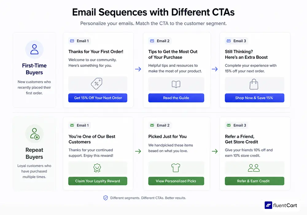
- Personalized CTAs outperform generic ones significantly
- Placement, design, and copy all affect CTA performance
- A/B testing is the only reliable way to know what works for your specific audience
What Is a Call to Action?
A call to action (CTA) is a short, direct prompt that tells someone what to do next. In marketing, it usually takes the form of a button, a hyperlinked phrase, or a line of text designed to move the reader toward a specific action.
A call to action (CTA) is text that tells the reader what to do next. It pushes them to take a step right away. That could be buying something, signing up, or moving forward. It uses clear and direct words. Phrases like “buy now,” “download,” or “get started” are common.
In ecommerce, CTAs appear everywhere,
- On product pages (“Add to Cart”),
- At checkout (“Complete Purchase”),
- In post-purchase flows (“Share with a friend”),
- In email campaigns (“Claim your discount”).
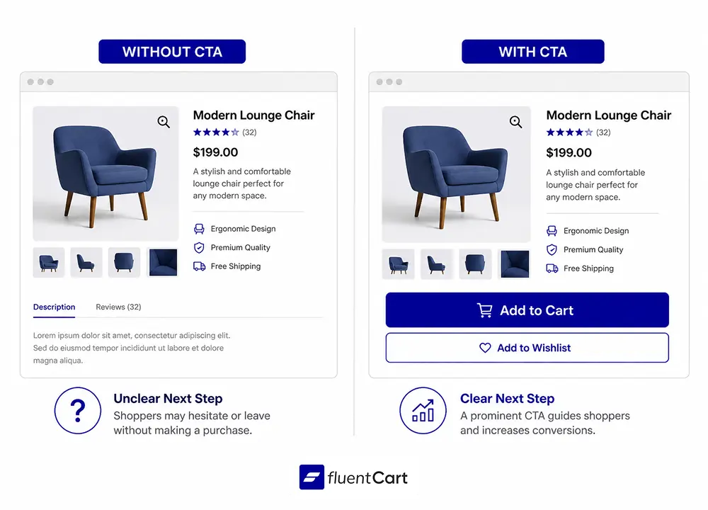
Their job is simple: remove confusion and give the visitor one obvious next step. Without a CTA, visitors engage with your content and then drift. With a strong one, they take action.
Why CTAs Matter More Than Most Store Owners Think
Most people assume poor conversions come from bad products or weak traffic. Sometimes that is true. But frequently, the issue is simpler: there is no clear instruction on what to do next.
Think about a physical store. A good salesperson does not wait for the customer to ask. They say, “Shall I wrap that up for you?” That prompt is a CTA. Remove it, and hesitation fills the gap. Online, hesitation is worse because there is no salesperson to recover the moment. A visitor who is unsure what to do next will simply close the tab.
HubSpot analyzed “over 330,000 CTAs and found that personalized CTAs convert 202% better than generic ones.” That is not a minor lift. It means the exact same traffic produces triple the conversions just by aligning the CTA to the visitor’s context and intent.
This is why CTAs are not a cosmetic detail. They are a core revenue lever.
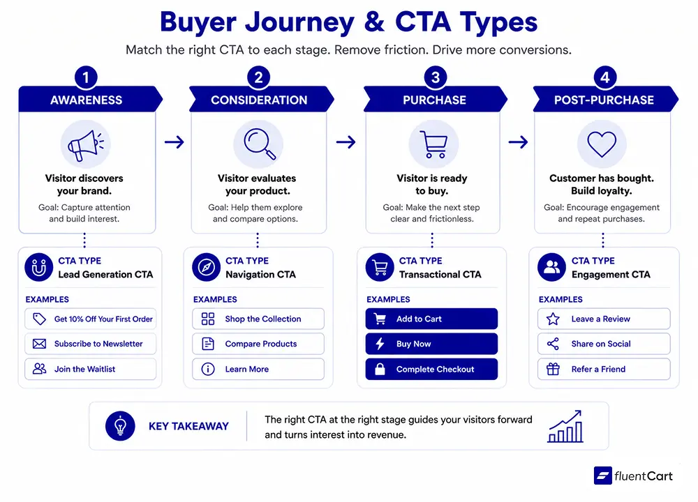
The Main Types of CTAs in Ecommerce
Not all CTAs serve the same purpose. The type you use should match the stage of the buyer journey and the goal of that specific page.
- Transactional CTAs are the ones tied directly to purchase action. “Add to Cart,” “Buy Now,” “Complete Checkout.” These appear on product pages and at checkout. They need to be unmissable, clearly worded, and surrounded by enough trust signals to make clicking feel safe.
- Lead generation CTAs are designed to capture interest before a purchase decision is made. “Get 10% off your first order,” “Join the waitlist,” “Subscribe for updates.” These work at the top of the funnel and build your list for future campaigns.
- Navigation CTAs guide visitors deeper into your store. “Shop the collection,” “See all deals,” “Learn more.” Their goal is not a direct conversion but keeping the visitor moving toward one.
- Engagement CTAs encourage social proof and sharing. “Leave a review,” “Tag us on Instagram,” “Refer a friend and earn credit.” These build community and trust. They tend to show up in post-purchase flows and email sequences.
Each type has a place in a well-structured store. The mistake most stores make is over-relying on transactional CTAs before the buyer is ready, or ignoring engagement CTAs altogether after the sale.
What Makes a CTA Actually Work
A button that says “Click Here” does almost nothing. A button that says “Get my free guide” does a lot more. The difference comes down to a few principles that consistently separate high-performing CTAs from forgettable ones.
- Specificity beats vague: Generic CTAs like “Submit” or “Learn More” give the visitor no clear sense of what happens next. Specific CTAs like “Download the sizing guide” or “Start my free trial” tell the visitor exactly what they get. Specific CTAs also feel lower-risk because there are no surprises.
- Benefit-led copy converts better: “Save my spot” performs better than “Register.” “Get my discount” outperforms “Apply code.” The framing shifts from what the visitor has to do toward what they get by doing it. That small shift reduces friction.
- Placement drives performance: Conventional wisdom says above the fold is best. It often is. But the right placement depends on the page’s purpose. A long educational page may convert better with the CTA after the argument has been made. Product pages with strong imagery often convert well with the CTA locked in a sticky bar that stays visible while the customer scrolls.
- Design creates visibility: A CTA button needs visual contrast. If the button color matches the background or competes with other elements, it disappears. The button does not need to be loud, but it does need to be obvious.
- Urgency, when real, works: “Limited stock,” “Offer ends tonight,” and “Only 3 left” prompt faster decisions. The key word is “when real.” Fake urgency erodes trust the moment a buyer sees the same countdown timer reset on their next visit.
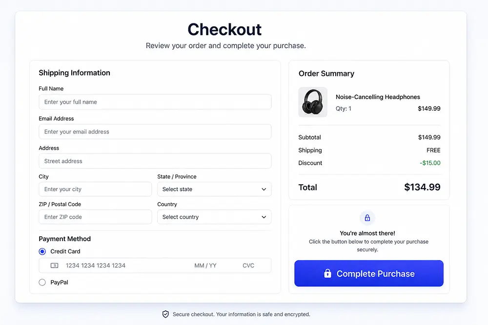
The Checkout CTA and Why It Is the Most Important One
Every other CTA on your store is building toward one moment: the checkout.
The CTA design and copy at checkout has an outsized effect on whether a sale completes or abandons. According to IRP Commerce data, “the average ecommerce conversion rate in 2024 was 1.65%, down from 1.97% in 2023.” That decline reflects, in part, friction in the final steps of purchase.
A checkout experience that is fast, clean, and built around a single clear CTA removes the decision fatigue that causes abandonment. Multi-step checkouts with competing prompts, unclear totals, and buried “complete order” buttons lose sales at the last moment.
This is part of why FluentCart’s effortless checkout experience is built the way it is: a streamlined, distraction-reduced flow designed so the primary CTA at every step is obvious and the path forward requires minimal effort. The fewer the decisions, the more likely the sale completes.
CTA Mistakes That Cost Ecommerce Stores Real Money
Some of the most common CTA errors come up repeatedly in ecommerce communities and store audits. They are worth naming directly.
- Too many CTAs competing at once: When a page has five different buttons all asking for attention, the visitor does none of them. Priority collapses when everything looks urgent. Every page should have one primary CTA and, at most, one secondary option.
- Mismatching the CTA to the traffic source: If someone clicks a Facebook ad about a summer sale and lands on your homepage with a generic “Shop Now” CTA, the continuity breaks. The CTA should reflect the promise of whatever brought the visitor there.
- Hiding the CTA below the fold on mobile: A large portion of ecommerce traffic is mobile. If the “Add to Cart” button requires scrolling to find, many buyers will not find it. Mobile-first design for CTAs is not optional.
- Using passive language: “You can subscribe here” is weaker than “Subscribe.” Passive voice diffuses the action. Active voice makes the CTA feel decisive.
- No CTA in email: It sounds obvious, but many store emails end without a clear next step. Every email your store sends should have at least one CTA aligned to the campaign’s goal. Whether it is recovering an abandoned cart, announcing a product launch, or re-engaging an inactive customer, the email needs to tell the reader what to do next.
A/B Testing: The Only Way to Know What Works for Your Store
There is no universal “best” CTA. The right copy, color, and placement depend on your audience, your product, and your store’s design. The only way to know is testing.
A/B testing runs two versions of a CTA simultaneously and measures which drives more conversions. You test one variable at a time: the button copy, the color, the position, the surrounding text. Changing multiple things at once makes it impossible to know what caused the difference.
Small changes produce significant results. One documented case changed a homepage CTA from “Book a demo” to “Talk to a Human” and saw a 110% increase in conversion rate. The product, the offer, and the page design stayed exactly the same. Only the CTA copy changed.
This is worth building into your store’s regular practice. An ecommerce CRO audit typically uncovers CTA issues as one of the most common and most fixable sources of lost revenue.
How FluentCart Supports CTA-Driven Selling
A CTA is only as effective as the experience it leads to. A well-written “Buy Now” button pointing to a slow, confusing checkout flow still loses the sale.
FluentCart is built so that every CTA in your store has somewhere useful to go. The product pages support strong “Add to Cart” placement. The checkout reduces friction so the final purchase CTA converts. The subscription and licensing features support recurring CTA flows where the goal is retention rather than a single purchase.
For stores selling digital products, the CTA at purchase needs to connect cleanly to instant delivery. For stores using FluentCRM alongside FluentCart, post-purchase CTAs in email sequences can be personalized based on what each customer bought, which brings us back to that 202% conversion lift from personalization.
The technical foundation of your store shapes whether your CTAs can do their job. A CTA designed well on a platform that executes it poorly still fails.
Wrapping Up
A call to action is not a button. It is the moment where a visitor decides whether to become a customer.
Every page on your store, every email you send, and every ad you run is moving toward a CTA. When that CTA is specific, visible, benefit-led, and placed where the buyer is ready to act, conversions follow. When it is generic, buried, or missing, traffic leaks.
Start with one page. Find the primary CTA. Ask whether it is clear, specific, and visually obvious. Change one thing and measure the result. That is the entire discipline of CTA optimization, and it compounds over time.
Once In a Lifetime Offer
FAQ
How long should a CTA be?
The sweet spot is two to five words for buttons. For text-based CTAs in emails or blog posts, one short sentence is enough. Anything longer loses impact because the reader has to work to understand what you want them to do.
Should every page have a CTA?
Yes. Even informational pages like an FAQ or an About page benefit from a soft CTA pointing visitors toward the next logical step. The goal is to never leave a visitor with nowhere to go.
Can you have more than one CTA on a page?
You can have a primary and a secondary CTA, but they should not compete. The primary CTA should be visually dominant. The secondary should be smaller and lower-commitment, for example “Learn more” alongside “Buy now.” More than two and you start splitting attention enough to hurt conversions.
Does CTA color actually matter?
Color matters less than contrast. A CTA button needs to stand out from its surrounding elements. The specific color is less important than whether it is immediately visible against the background and nearby content.
What is a ghost CTA?
A ghost CTA is an outlined button with no fill, typically used as a secondary option alongside a solid primary button. It signals lower commitment and is useful when you want to offer an alternative without giving it equal visual weight to the main action.
Once In a Lifetime Offer

Deputy Marketing Lead, published literary author, and musician. I thrive on marketing for tech companies while composing music, collecting books of lasting depth, exploring cinema with a discerning eye, and studying the arts and history.

Subscribe now
Related Articles and Topics
-

What is Brand Equity? Meaning & How to Build One
Brand equity is the value a brand name generates beyond the product. Learn its meaning, components, and how…
-
How to Write a Press Release in 2026: A Tactical Guide for SMBs
You spent two weeks writing a press release for your product launch. You sent it to 40 journalists.…
-

What Is Prospecting? How to Build a Sales Pipeline
Learn what prospecting is in sales and business, how it differs from lead gen, and what methods fill…


Leave a Reply