

Types of Ecommerce Checkout and Where to Use Each
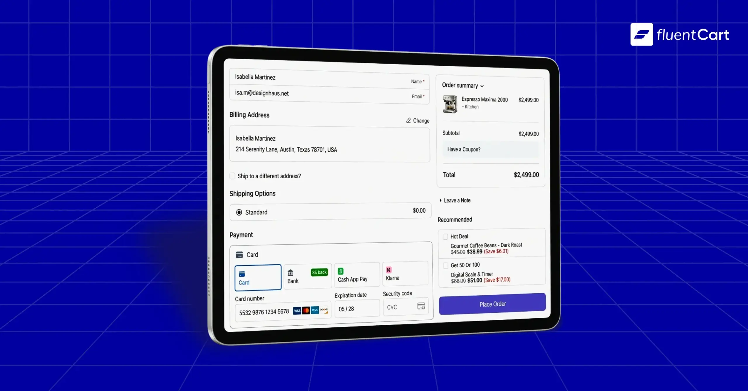
There are three main types of ecommerce checkout: a checkout page, a modal checkout and an inline (on-page) checkout. Ecommerce checkout itself is the run of screens between “Add to cart” and “Order confirmed,” and most stores need all three types, since each one fits a different moment in the buyer’s day. Pick the wrong one for the moment, and you lose the sale at the very last step.
You know the feeling. Traffic looks fine, carts keep filling up, and orders still trickle in. So you tweak photos, rewrite descriptions and run another ad. But the leak often sits in your ecommerce checkout, and most store owners never walk through it on their own phone.
There is a lot to uncover, so keep reading. We’ll break every type into its layers, then show you where to use each one.
TL;DR
- The three main types of ecommerce checkout are the checkout page, modal checkout and inline (on-page) checkout.
- Labels like one-page, multi-step, accordion, hosted and embedded fit inside these three types.
- The checkout page can be self-hosted or hosted, and it works as the home base for carts.
- Modal checkout suits quick buys from blog posts, product cards and pricing tables.
- Inline checkout suits landing pages with one clear offer.
- The same layers sit under every type: guest or account-based, one-page or multi-step, how the buyer gets in, one-time or subscription, and how they pay.
- Most stores should run more than one type, matched to what the buyer wants in that moment.
- Express checkout and digital wallets make ecommerce payments faster, especially on phones.
- Tax display and card authentication change by region, so check local rules.
Types of Ecommerce Checkout
Strategy-wise, every ecommerce checkout falls into one of three types. The type answers a single question: where does the buyer pay?
Think of the three types as the top layer. Under each one sit the same decisions: who the buyer is (guest or account-based), how the screens are laid out (one-page or multi-step), how the buyer gets in, what they pay for (one-time or recurring) and how they pay. The tree below shows the whole picture.
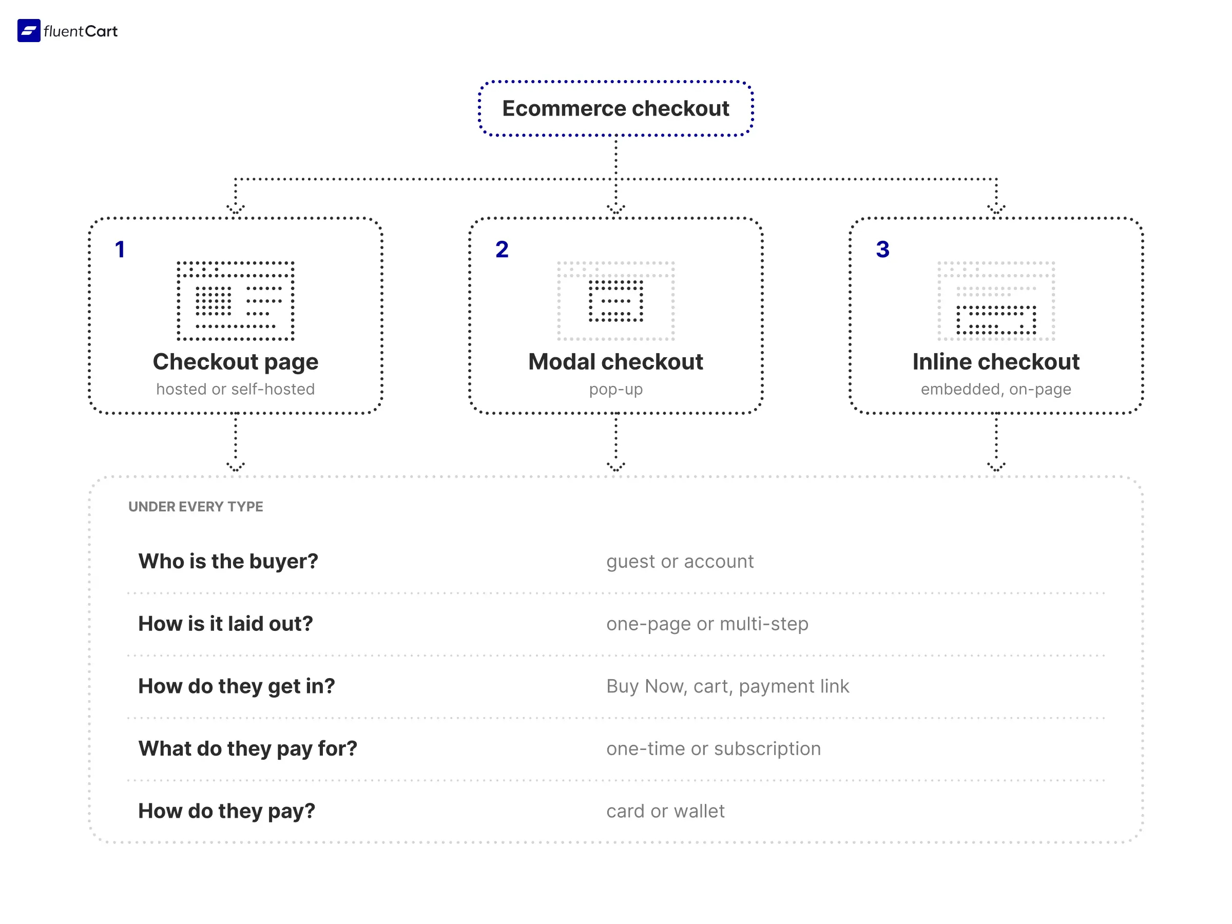
There a lot of information in here. So here is quick path or guide per say. Where the buyer pays is what separates the three types, so we cover it right here. Everything else sits under every type, so we explain it once in its own section after the types. Under each type, you’ll only see what changes for it.
Let’s walk down each branch and take your time; this is a deep dive.
1. Checkout Page
A checkout page is a dedicated page where the buyer reviews the order, enters details and pays. Of all the types of ecommerce checkout, it is the home base, since carts with several items, shipping choices, coupons and tax all fit here naturally.
Let’s say you sell forty products. The buyer adds three, compares delivery options, applies a coupon and pays. That journey needs room, and a full page gives it room. As you can see, that’s why most catalog stores start here.
Self-Hosted (On-Site) Checkout Page
Self-hosted checkout pages live on your own site, so you control the design, the fields and the customer data. That makes it the natural pick when your brand, your reports and your email flow matter to you. If you run a WordPress store, this is the usual setup.
The price of control is upkeep. You test it, you update it and you watch it after every change. That way, nothing surprises you on a busy sale day.
- Keep the header and footer light
- Show the total before the Pay button
- Retest after every plugin or theme update
Hosted Checkout Page
Someone else runs a hosted checkout page, either a store platform or a payment provider. With the provider version, the buyer is sent to a secure page to pay and then sent back to your site. That page runs on a payment gateway, and webhooks tell your store the payment cleared.
Choose it when launch speed and fewer security chores matter more than design control. Small teams, first stores and side products often fit here. Watch the handoff, though. Some buyers pause when the page looks nothing like your store.
- Match your logo and colors where the provider allows
- Set a clear return page after payment
What Changes on a Checkout Page
- Guest or account-based: guest first, with the account invitation after payment
- Layout: one-page for short orders, multi-step when the order needs shipping choices or extra mandatory information
- Getting in: the only type built around a cart, so Add to cart, a mini cart and payment links all live here
- Wallets: express buttons sit at the top of the page
Selling from the EU, UK or EEA? Extra rules apply to you, from tax display to card approval steps. We’ve covered them in the regional section further down, so keep reading.
2. Modal (Pop-Up) Checkout
A modal checkout opens the payment form in a pop-up over the page the buyer is already on. Nobody navigates away, so the momentum stays intact.
Let’s say a reader finishes your blog post about a template and wants it right now. Sending them through a cart, a cart review and a full checkout page adds steps they never asked for. Put a modal on the buy button and they stay exactly where they are. As you can see, the modal protects the moment of intent.
Where to Place Modal Triggers
The best triggers sit where a visitor says yes before browsing any further.
- Blog posts and guides
- Product cards and pricing tables
When a Modal Is the Wrong Choice
Big carts, complex shipping, heavy coupon use and orders that need a long list of mandatory details belong on a checkout page. Modals squeeze them into a small window, and small windows on phones are unforgiving. When the order starts to outgrow the pop-up, send the buyer to the full page.
What Changes in a Modal
- Guest or account-based: guest only, since login walls feel heavy inside a small window, with any account created from the checkout details
- Layout: compact, with one panel for digital products and two or three for physical items or short extra details
- Getting in: a Buy Now button or link, with no cart page in between
- Wallets: lead with them, because typing in a small window is a chore
- Billing: keep renewal terms short and visible
One more thing. Modals skip the cart page, so the order summary and the tax line are easy to miss. We cover how to keep both visible in the mistakes section below.
3. Inline (Embedded) and On-Page Checkout
An inline checkout, also called an embedded or on-page checkout, puts the payment form inside the page itself. The buyer picks a product or plan, watches the total update, and pays without leaving the landing page.
Let’s say you run an ad for a course launch. The click lands on a page with the pitch, the proof and the price. Sending that visitor somewhere else to pay is a detour. An on-page form puts the pitch and the payment on the same screen.
Single Offer or Plan Picker
On-page checkout works for one product, several products or a set of plans. Live totals matter here. When the buyer switches a plan or ticks an extra, the price should update on the spot.
Highlight one default option. That way, the buyer sees a clear starting point instead of a blank decision.
Strategy for Landing Pages
- Put the price and the form close together
- Keep the form short
- Place proof near the payment button
- Remove menus and extra links
Add-on offers beside the total can lift order size without adding a step. Keep it relevant and keep it optional.
What Changes on a Landing Page
- Guest or account-based: guest, with the account created from the checkout details
- Layout: one-page, so the form stays short, with a step added only when the offer needs extra details
- Getting in: the product or plan picker replaces the Buy Now button
- Wallets: place them beside the pay button
- Billing: plans are often recurring, so put renewal terms next to the price
Landing pages often sell subscriptions and digital products, and both bring extra payment steps behind the scenes. We trace that route later in this guide, so keep reading.
That covers the three types of ecommerce checkout, but there is more. Every type shares a set of layers underneath: who the buyer is, how the screens are laid out, how they get in, what they pay for and how they pay. Keep reading, since those layers decide whether the type you picked actually works.
Layers Under Every Type of Ecommerce Checkout
The three types of ecommerce checkout decide where the buyer pays. Everything below stays the same whichever type you use, so we cover each layer once.
Guest or Account-Based Checkout
Guest checkout lets a buyer shop without logging in, and it is the standard. If a login comes up at all, it comes up during checkout. Or the details the buyer already typed create the account for them, so there are no extra steps in between.
Account-based checkout asks buyers to log in first. That suits memberships, repeat orders and anything managed over time.
Guest checkout hides the login, not the record. The store still saves the customer and the order, so you can send receipts and follow up. Here’s the thing: you can offer both, with the account invitation arriving after payment.
One-Page or Multi-Step Layout
One-page layouts put every step on a single screen, while multi-step layouts split the checkout across several screens, usually with a progress indicator. Either one can sit inside any type. A checkout page can be one long screen, a modal can walk through a few quick panels, and an on-page form can add steps too.
Multi-step checkout earns its place when the order needs extra mandatory steps before payment. Let’s say you sell paid consultations. Before you can send the final invoice, you need the scope of the work, the timeline and the conditions the client has to accept. Those details get their own steps, and the buyer can’t pay until each one is done.
Or let’s say you sell cars or bikes. Fulfillment needs the model details, the delivery or pickup choice, and often documents or registration information. As you can see, those steps are part of the sale itself, and a one-page form would either hide them or leave them out.
Two variations come up often. A 2-step checkout splits contact and shipping details from payment, while an accordion keeps one page and collapses each section once the buyer finishes it.
So the rule is simple. One-page fits digital products, tickets and short forms where nothing extra is needed. Multi-step fits shipping choices and any order that needs mandatory information first. Whichever you pick, show the finish line early, since people like seeing how far they have left to go.
How Buyers Get In
How a buyer gets into checkout matters as much as the checkout itself. Buy Now sends them straight in with one product. Add to cart lets them keep browsing and pay for everything at once.
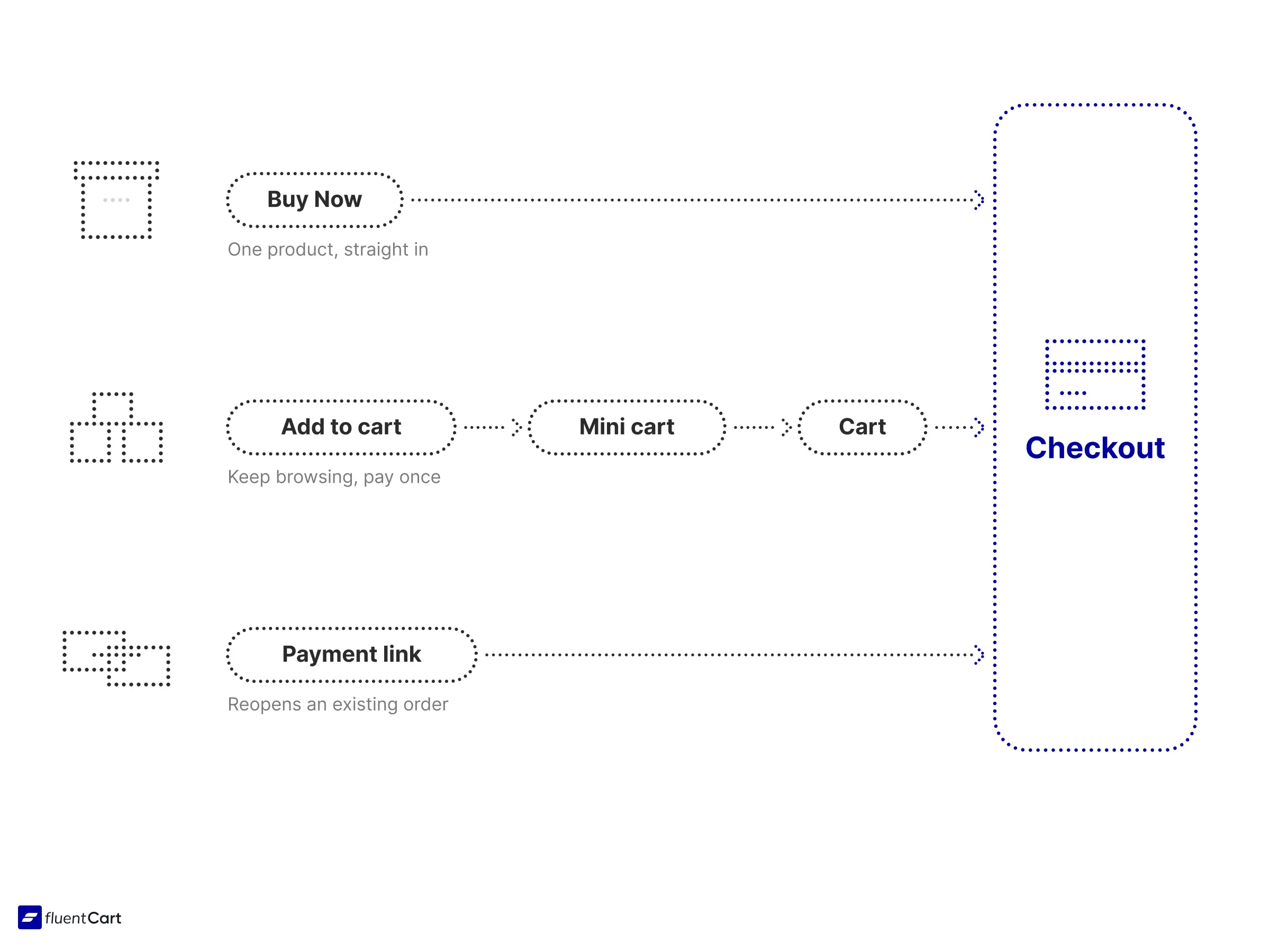
Mini carts and cart drawers are shortcuts to the cart, so they count as a route in rather than a type. Payment links work differently: they reopen checkout for an order that already exists, such as a renewal invoice.
Single-product offers lean toward Buy Now. Catalogs lean toward the cart. Mixed stores often need both.
One-Time or Subscription Checkout
Subscription checkout is built for recurring payments, so it has to explain the future as clearly as the present. Show the price today, the price at renewal, the renewal date and how to cancel. Most businesses don’t figure this out until the first wave of “why was I charged?” emails lands.
Subscriptions are also the one exception to guest checkout, since renewals need an account to manage. Digital products need less. The buyer sees what they get, whether that is a download, a license key or access to a course.
Express Checkout and Wallets
In September 1999, Amazon was granted a patent on one-click ordering. Within weeks, it sued rival bookseller Barnes & Noble over a similar button. Companies don’t go to court over a button unless the button moves money.
Express checkout lets a returning shopper pay with saved details or a digital wallet in a click or two. Wallet-based ecommerce payments like Apple Pay, Google Pay and PayPal all work this way. Often the buyer confirms with a fingerprint or a face scan and skips typing a card number.
On a phone, that skipped typing is the whole point. Put the express buttons at the top whichever type of ecommerce checkout you use, and label them clearly so buyers who prefer the regular form don’t hesitate.
Payment Methods Buyers Expect
Ecommerce payments come down to a short menu. Cards cover the default case, wallets cover speed, and bank transfers, pay-later options or local methods cover buyers who prefer them. Pick the ones your own customers already use, since two or three well-chosen methods are usually enough.
How Each Layer Plays Out by Type
The table below pulls the layers and the types of ecommerce checkout together, so you can see what changes at a glance.
| Layer | Checkout page | Modal | Inline / on-page |
|---|---|---|---|
| Guest or account-based | Guest checkout first, with an account invitation after payment | Guest only, since a login wall feels heavy in a small window | Guest checkout, with the account created from the checkout details |
| Layout | One page for short orders, multi-step when the order needs shipping choices or mandatory information | Compact panels, two or three at most | One page, with a step added only when the offer needs extra details |
| Getting in | Add to cart, mini cart, Buy Now or payment links | Buy Now button or link, with no cart page in between | Product or plan picker right on the page |
| One-time or subscription | Full renewal details on the page | Short, clear terms inside the pop-up | Renewal terms right beside the price |
| Wallets | Express buttons at the top of the page | Wallets lead, since typing in a small window is a chore | Wallet buttons beside the pay button |
Where to Use Each Type of Ecommerce Checkout
All kinds of shop owners need all three types of ecommerce checkout. The skill is matching the type to the moment: the catalog shopper gets the checkout page, the blog reader gets the modal, and the person who clicked your ad gets the on-page form.
| Type | Best for | Main trade-off |
|---|---|---|
| Checkout page (self-hosted) | Full catalogs, mixed carts, tax and shipping-heavy orders | Upkeep and testing |
| Checkout page (hosted) | Quick launches, fewer security chores | Buyer leaves your site |
| Modal | Fast buys from posts, product cards and pricing tables | Tight space on small screens |
| Inline / on-page | Landing pages, course and plan offers, campaign traffic | Long forms on a busy page |
If you’re running on WordPress, something like FluentCart just handles this for you. FluentCart’s checkout comes in three formats: a checkout page and a modal checkout in Free, plus an on-page checkout form in Pro for landing pages. Buy Now, cart-based buying and guest checkout all work with them, and order bumps need Pro. That way, you pick the format per product and let the plumbing run.
Not sure where to start? An ecommerce CRO audit shows you exactly where buyers drop off, so you change the right thing first.
You can start your store now
Download FluentCart for free and setup your online store and start selling from today.
The Ecommerce Checkout Process Step by Step
Now that you know the types of ecommerce checkout, the layers and where each one fits, let’s get clear on what ecommerce checkout is. Ecommerce checkout, also called the checkout process, is the series of steps a shopper completes to turn a filled cart into a paid order.
Every ecommerce checkout, from a corner shop to a giant retailer, runs through the same seven moments. Stores differ in how they package them.
- Cart review: shoppers check items, change quantities and add a coupon.
- Account choice: log in, sign up or continue as a guest.
- Shipping details: address and contact info.
- Shipping method: delivery speed and price.
- Payment: card, wallet, bank transfer or a pay-later option.
- Order summary: one last look at items, tax, shipping and the total.
- Confirmation: the thank-you page and the receipt email.
If you sell digital products, steps 3 and 4 vanish. Fewer screens. Fewer exits. Consultations and vehicles run the other way, since extra mandatory steps slot in before payment.
Why the Last Few Screens Matter
Let’s say you’re on your phone with your thumb over the Pay button. You expected $50, and the total now reads $68. Nothing was wrong with the charges, but you are seeing them for the first time.
Shipping and tax are real costs, and tax is often a legal requirement. No store should skip them. The trouble starts when shoppers meet them late.
The carts you can win back belong to people who did want to buy. Among shoppers who left for a reason other than just browsing, 40% said extra costs were too high, and 12% said they could not see or calculate the total up front. Nearly 1 in 5 also said the ecommerce checkout felt too long or complicated.
The fix is not to drop shipping or tax. Show them early, keep the form short, and nobody gets a surprise on the last screen. That is why the last few screens matter.
Ecommerce Checkout Differences by Region
If you sell to the EU, UK or EEA, this is the part we promised. Strong customer authentication rules apply to card payments there, so some buyers will see an extra approval step. Prices usually show with tax included, and digital goods bring their own VAT rules. If you sell digital goods into the EU, the VAT rules for digital goods in the EU deserve a read before you set up tax.
Elsewhere, expectations shift. In AU, shoppers also expect tax-inclusive prices. In the US, sales tax is typically added at the end, which is exactly the total-jump from the Pay-button moment earlier. If you sell there, show an estimated total early.
Habits around ecommerce payments differ too, so offer the methods your local buyers already trust. Rules also differ across the US, UK, EU, AU and JP, so check local law before you sell.
Ecommerce Checkout Mistakes That Cost Sales
Small leaks. Each one looks minor, but the same mistake sits in front of every single buyer.
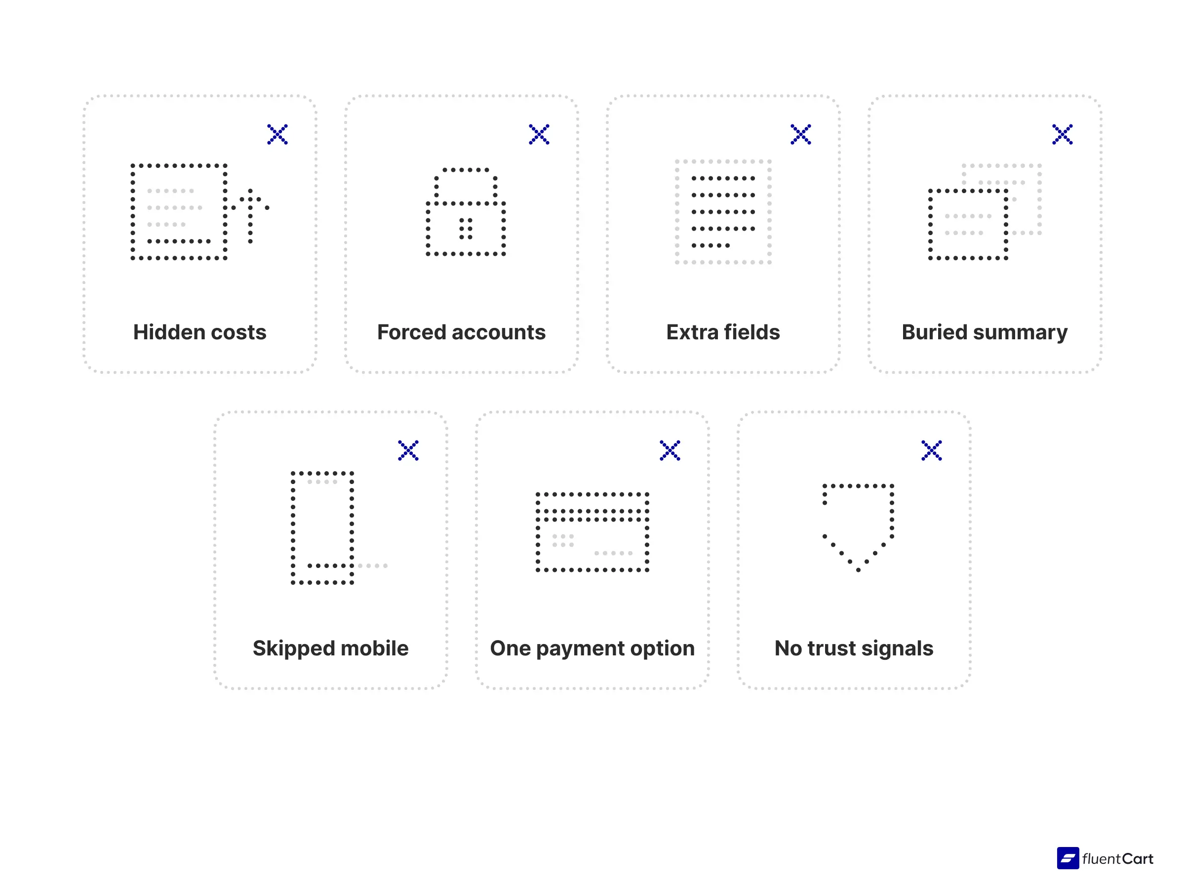
- Don’t hide costs. Show shipping and tax early.
- Don’t force accounts. Let people pay first.
- Don’t ask for what you don’t need. Most checkouts can cut the number of form elements by 20 to 60%, and every mandatory step should earn its place.
- Don’t bury the summary. In a modal, keep the order summary and the tax line in view, right next to the Pay button.
- Don’t skip mobile. Test every type of ecommerce checkout you run on a real phone with a real thumb.
- Don’t thin out payment choices. One card form is rarely enough.
- Don’t skip trust signals. Keep security badges and clear return terms near the Pay button.
The upside is real. Testing on large stores suggests the average one could lift conversions by 35.26% through better ecommerce checkout design alone. For a longer fix list, see these ways to reduce cart abandonment.
Types of Ecommerce Checkout FAQ
What are the main types of ecommerce checkout?
The three main types of ecommerce checkout are the checkout page, the modal checkout and the inline (on-page) checkout. Layout, guest access, how the buyer gets in and payment options sit underneath all three.
Is one-page or multi-step checkout better?
Neither wins everywhere. One-page suits digital products and short forms, while multi-step suits orders with shipping choices or mandatory details before payment.
What is the difference between hosted and embedded checkout?
Hosted checkout sends the buyer to a page run by a platform or payment provider. Embedded (inline) checkout puts the payment form inside your own page, so the buyer never leaves.
What does “proceed to checkout” mean?
It is the button that moves a shopper from the cart to the payment steps. After that click, the cart is locked in for payment.
How many steps should a checkout process have?
As few as your product allows. Digital goods can often finish on one screen, while physical goods usually need shipping steps on top. Some products add mandatory steps of their own, such as a consultation brief or vehicle details. Count the questions you ask, and cut any you can answer later.
Time to Test Your Own Checkout
Open your store on your phone, add a product and walk your whole ecommerce checkout like a stranger would. Try the checkout page, the modal and the landing page, one after another. Count the taps, the fields and the surprises.
Whichever of the types of ecommerce checkout you pick, it is the last thing a buyer sees before paying, and it has to be right.
Real store owners. Real-life problems. Real answers. Join the FluentCart Community.

Hi, this is Abir, a Deputy Marketing Lead, passionate product designer, and WordPress core contributor. Creating interesting content and products that ensure a 360-degree customer experience is my daily job.

Subscribe now
Related Articles and Topics
-
WooCommerce vs FluentCart: Which Fits Your Store
WooCommerce or FluentCart? See what each does from the start, what it costs as your store grows, and…
-
Best Black Friday and Cyber Monday Deals for WordPress (2026)
Black Friday and Cyber Monday deals for WordPress in one list: 2026 discounts on plugins, themes, and hosting,…
-
What Is a Digital Download? (Plus How to Sell Your Own)
A digital download is a file you buy online and keep on your device, like an ebook or…




Add your first comment to this post