eCommerce Product Page Design: Strategies, Inspirations, and Best Practices
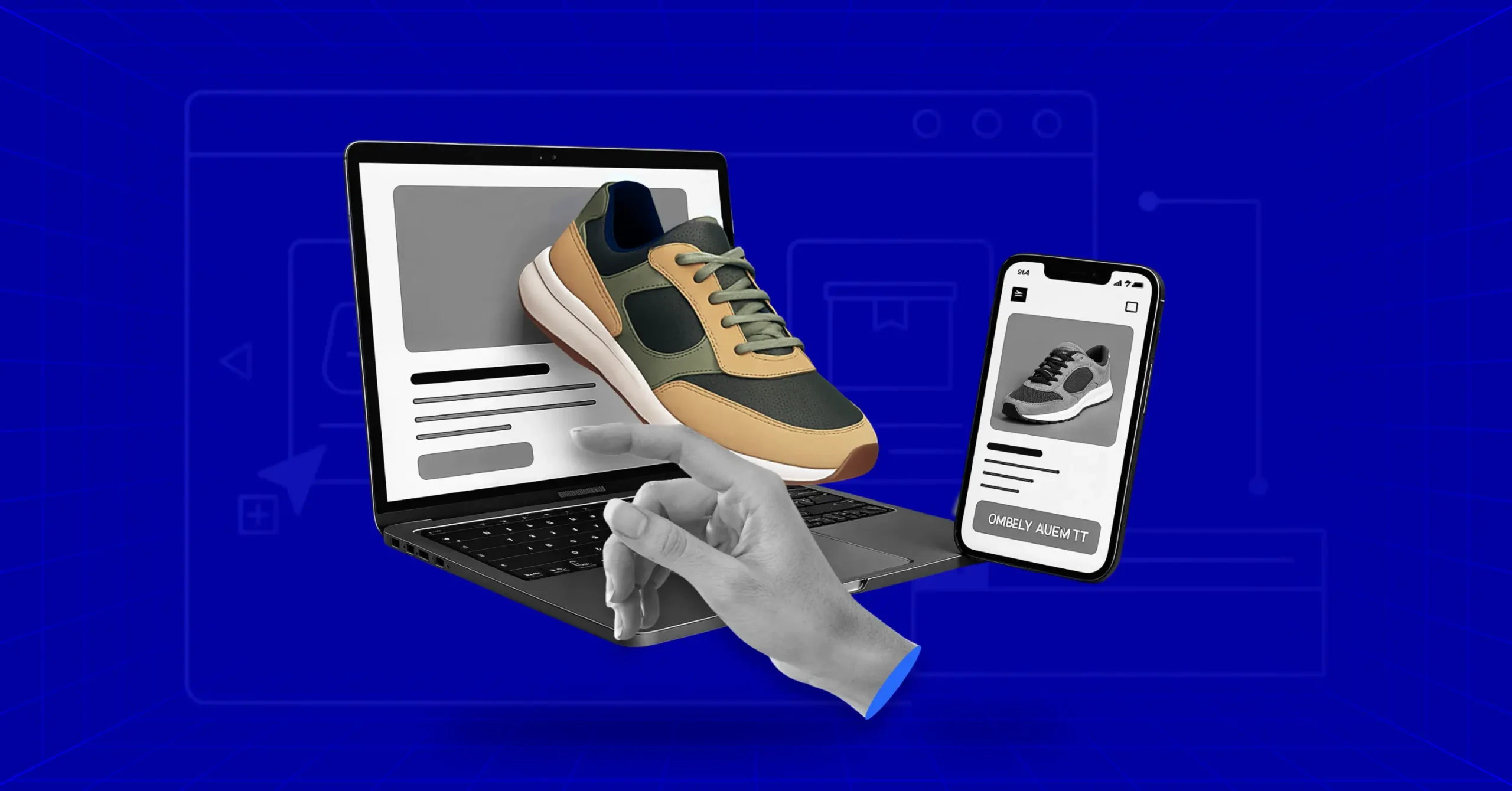
When you’re building an eCommerce store, the product page is one of the most important parts of your business. It’s where the graphics, colors, typography, and words all come together to do one job. Here is the place where a curious visitor transforms into a customer.
If you’re deciding where to spend your energy, focus on the product page over your “About” section or your landing pages. This is where you refine the essentials.
It’s about more than just a description; it’s about using interactive elements and high-impact visuals to highlight the benefits that actually solve a problem for your visitor.
Most modern eCommerce platforms give you a head start with templates, but a template is just a skeleton. To help you put some muscle on those bones, we’ve gathered some of the best product page examples in the industry.
Let’s look at why these specific designs work and how you can steal their strategies for your own store.
What is a Product Page?
A product page is the single page on your site dedicated to one product. It’s where browsers become buyers or click away forever.
It is your digital sales floor. It should include everything a customer would normally look for in a physical product business. In an offline store, a visitor can touch the product, inspect it closely, and try to understand it before making a decision.
On an eCommerce product page, you have to deliver that entire experience through content and add something extra: trust. Because you won’t be there in person to answer questions. And for an online store, nothing is more important than credibility.
The Anatomy of a Product Page
Every product page has some core elements like images, title, price, and description explaining why someone should care. Then there’s the add-to-cart button. That’s where intention becomes action.
Modern pages go further. Customer reviews make the product page more trustworthy. Size guides and specs answer questions before they’re asked. Shipping info and security badges reduce friction. Some stores add videos, 360-degree views, or AR features.
What you include depends on what you sell. Tech products need specifications. Fashion needs fit information. Furniture benefits from room visualizations.
Why Product Pages Matter
If you are doing product SEO well, most visitors land directly on product pages from Google or social media, not your homepage. That means each page needs to work as a complete sales pitch on its own.
The average store converts 1.58% of visitors. Top performers hit 3-6%. The difference isn’t traffic or ad spend. It’s how well the page is.
When you improve conversion by 1%, you’ve increased revenue by 50% without spending on paid ads. All your marketing points here. If this page doesn’t convert, nothing else matters.
Key Elements of Product Pages
Your product page is made up of multiple elements working together. Get one wrong, and you lose sales. Getting everything right will build something that actually converts. Let’s break down what needs to be on every product page with some examples.
High-Quality Product Images
Images do the heavy lifting. When customers can’t touch a product, they decide based on what they see. And image quality matters more than descriptions or reviews for most buyers.
High-quality photos convert up to 94% better than poor ones. That’s the difference between a sale and a bounce.
What works
- eCommerce product photography best practices: Build a simple home studio. Use a table, diffused window light, and a clean backdrop.
- Multiple angles: Show front, back, sides, and details. Aim for 5–8 images minimum (top brands use 8–12).
- Zoom & 360° views: Let shoppers inspect details. 360° views can boost conversions by 27%+.
- Lifestyle shots: Show the product in real-life use so people can relate to it.
Example
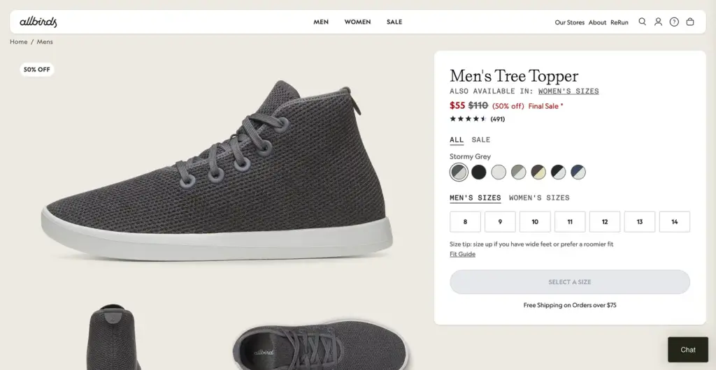
There are many good examples of that. Allbirds shows every angle of their shoes, close-ups of materials, and lifestyle shots of people actually wearing them.
Or if you see Apple, their product pages feature massive, zoomable images with interactive elements.
Compelling Product Descriptions
This is where you need to be sharp and thoughtful at the same time. A good product description doesn’t just explain what the product is. It quietly answers the question in your customer’s head: why should I care?
Most stores get this wrong. They dump a list of features and hope that’s enough. It’s not. Features inform. Benefits sell.
What actually works
- Make it easy to scan. People don’t read word by word. They just skim. Bullets help to point out standout features, short paragraphs for benefits, and clear subheadings.
- Match your audience’s level. Selling to beginners? Make it simple by skipping the jargon. Selling to pros? Give them the specs and details they expect.
- Answer “why buy this?” early. What problem does it solve? What gets easier, faster, or better after buying it? That’s the real hook.
- Keep the description focused. Build confidence without overwhelming.
- Optimize for SEO. Don’t overdo that. Don’t push keywords. Make the description contextual and on point.
Examples
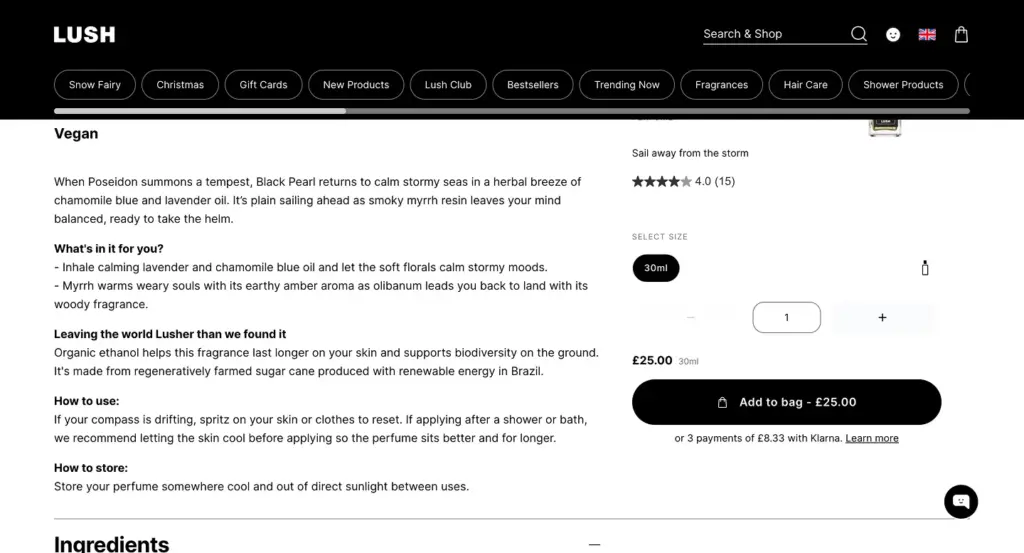
Some brands mastered product description very beautifully. Like Lush turns descriptions into mini-stories. They briefly describe where ingredients come from, why they matter, and how they smell and feel.
Clear and Prominent Pricing
Product pricing is one of the most important things on your product page. Hide your price and watch people leave. It’s that simple.
Display pricing as clearly as possible. Show both the original and discounted prices if there’s a sale. Visitors love seeing that they’re saving.
User Charm pricing for the products. $9.99 feels cheaper than $10 even though it’s one cent different. Use it strategically.
If you offer payment plans or financing, mention it right by the price. “Or 4 interest-free payments of $25” removes a major barrier for expensive items.
Examples
Amazon shows price front and center with savings percentages and Prime delivery details. Best Buy displays financing options directly under the price for big-ticket electronics.
Strong Call-to-Action Buttons
This is the moment where browsing turns into buying. The CTA button is where people stop thinking and actually do something. So it can’t blend in or play it safe. Your CTA should be impossible to miss.
The words on the button matter more than most people think. Use a punch line like “Add to Cart”, “Add to Bag,” “Get Yours Now,” or “Buy It Today”. There’s no universal winner here, so test and see what fits your brand voice and audience.
Button Size matters. Especially on mobile. The button should look obviously clickable. On longer product pages, a floating CTA that follows users as they scroll can quietly boost conversions without being pushy.
Examples
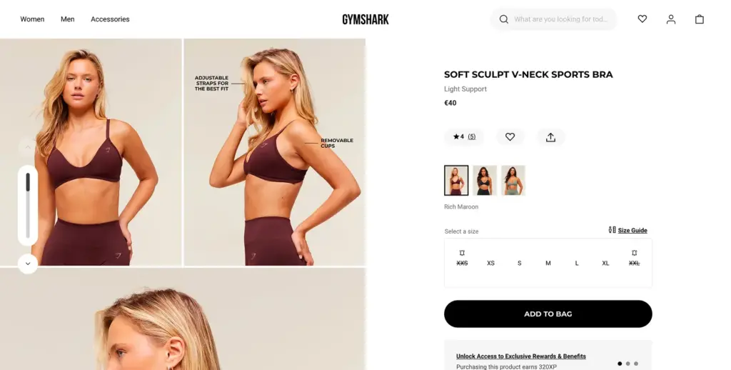
As a best practice, Gymshark uses bold, high-contrast buttons that pop instantly against their dark layouts. The CTA doesn’t shout. It simply shows up at the right moment and makes the next step feel obvious.
Customer Reviews and Social Proof
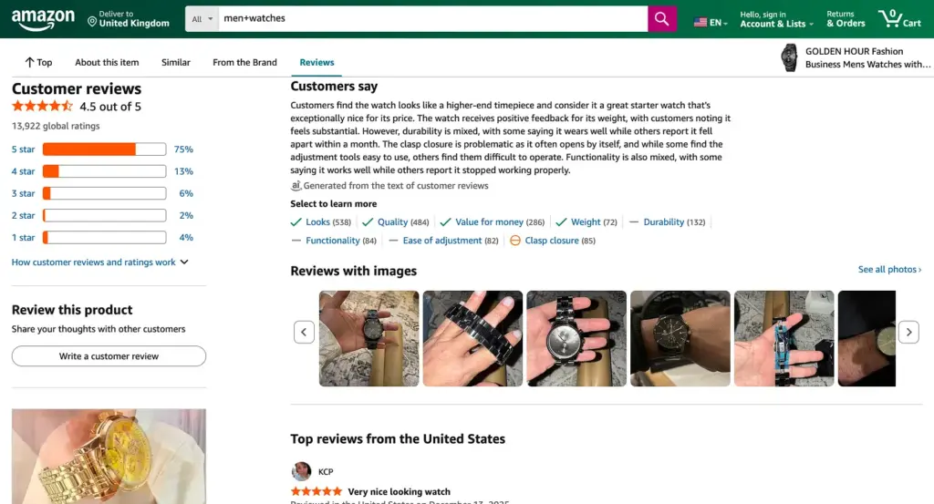
People don’t trust what you say about your products. They trust what other customers say.
75% of online shoppers rely on product photos and reviews to make purchasing decisions. Products with reviews convert significantly better than those without any reviews.
What to include
Keep the star ratings displayed prominently near the product title. Review counts matter too. A 4.5-star rating from 847 reviews is more reassuring than a 4.8-star rating from just 3 people—there’s strength in numbers.
If customers upload images, feature them. Photo and video reviews from real customers build more trust than text alone. Good brands keep a wall of love, a testimonial dedicated page to feature the customer reviews.
Don’t hide negative reviews. Respond to them professionally. It shows you care about customer experience and makes the positive reviews more credible.
Examples
Amazon’s review system is the gold standard. Spanx features customer photos prominently. Manitobah Mukluks integrates reviews throughout the product page, not just at the bottom.
Product Videos
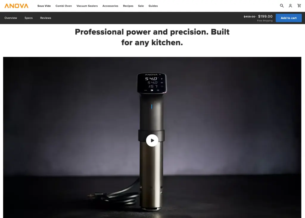
Products with video see shoppers 144% more likely to add items to cart, and 74% make a purchase after watching. That’s a massive impact for one element.
Videos work because they show what photos can’t. It’s the easier way to show how fabric moves, how features work, and what size really looks like on a person.
Types that work
Show product demonstration in videos. Unboxing creates excitement and shows exactly what arrives. How-to videos help people understand products better. Customer testimonials build trust through real experiences.
Short videos under 60 seconds perform best. Make sure they work on mobile without needing sound (add captions).
Examples
Anova uses cooking demonstration videos for its sous vide devices. Cricut shows project examples that inspire creativity. Both prove the product’s value instantly.
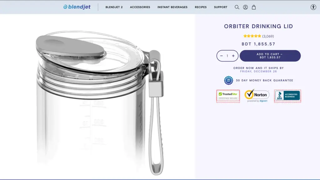
Trust Signals and Security Badges
If people don’t trust your site, they won’t enter payment information. Simple as that.
Display SSL certificates and security badges near the checkout button. Show accepted payment methods. People look for their preferred option before buying.
Highlight your return policy and money-back guarantee. Mention warranty details. If you’re certified by industry organizations or featured in major publications, show those badges too.
These elements reduce purchase anxiety, especially for first-time customers.
Examples
BlendJet displays trust badges, free shipping, and its guarantee prominently. Leesa includes financing options, trial periods, and warranty info right on the product page.
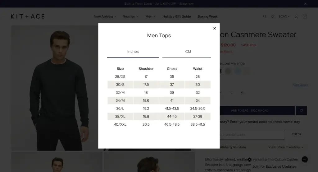
Size Guides and Specifications
For clothing, detailed size charts with measurements are very important. Mention in both inches and centimeters. Don’t forget to show fit information
For furniture or items alike, provide exact dimensions so people know if it fits their space. For tech products, list full specifications. People compare features before buying.
Make guides easy to access, but don’t force people to leave the page. Pop-ups or accordion sections work better than linking to separate pages.
Examples
Kit + Ace provides detailed fit guides with model measurements. Spanx includes size recommendations based on customer feedback.
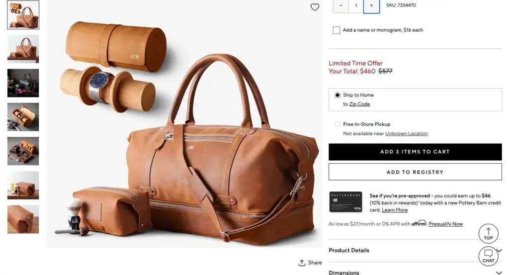
Shipping and Return Information
Surprise shipping costs are the number one reason people abandon carts. Don’t make people guess.
Show estimated delivery dates right on the product page. If shipping is free, say so prominently. If there’s a free shipping threshold, tell them how much more they need to spend.
Make return policies easy to find and easy to understand. “30-day returns, no questions asked” is clearer than a wall of legal text.
Examples
Obvi shows delivery estimates and free shipping thresholds clearly. Pottery Barn includes detailed shipping and return info in expandable sections.
Product Recommendations
Cross-selling and upselling happen naturally when done right. Show related products, frequently bought together items, or “complete the look” suggestions.
AI-powered recommendations work. Stores using personalized product recommendations see up to 4.5x higher conversion rates. That’s because they show people products they actually want.
Keep recommendations relevant. “Customers who bought this also bought…” works better than random suggestions.
Examples
Lucy & Yak shows “complete the outfit” recommendations that make sense. Amazon’s “frequently bought together” section is so effective that it’s been widely copied.
Product Page Design Best Practices
Having all the “right” elements doesn’t mean much if your design is fighting against you. A product page user experiences have to be effortless. The journey should be easy to understand and clear about what to do next. This is what actually helps pages convert.
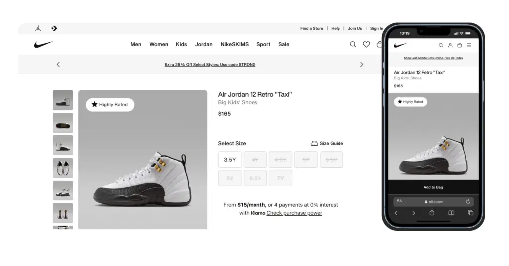
Mobile Responsive Design
Mobile responsiveness is a must. Around 70% of retail traffic comes from mobiles. If your product pages don’t look good on mobiles, most people won’t even see what you’re selling.
Start by designing for small screens. Then scale up. A page working well on mobile almost always fits on a desktop. Designing for bigger screens and then shrinking them down rarely works.
Buttons should be easy to click. Aim for a minimum of 44×44 pixels. Place your main CTA where thumbs naturally rest. The lower third of the screen. Use accordion layouts to hide extra details and keep the page clean, the way Best Buy does.
And don’t rely only on browser emulators. Test on real screens and networks. A perfect page on your laptop might feel clunky or slow on a phone using mobile data.
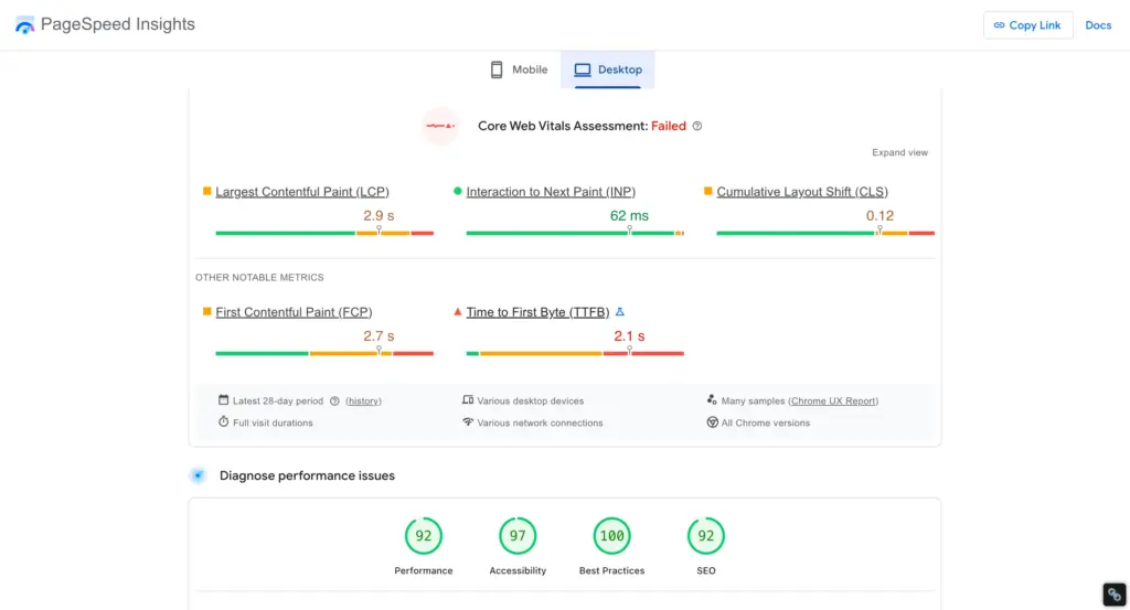
Page Speed Optimization
Pages that load in about one second convert at roughly 3%. Stretch that to five seconds, and conversions drop to just over 1%. That’s a massive loss caused by nothing more than waiting time.
Images are usually the biggest problem. Compress them properly. You can use lazy loading so images load only when someone scrolls to them. And must clean up unnecessary scripts and plugins. Use a CDN to deliver content faster across locations.
Tools like TinyIMG, Crush. pics, and Google PageSpeed Insights make this easier than it sounds. They’ll tell you exactly what’s slowing your page down and how to fix it.
White Space and Visual Hierarchy
The visual hierarchy defines what people will see first. White space gives the product room to breathe. The brain processes pages in order of importance. The biggest, boldest elements get attention first.
That should be your product image. Next comes price and product name. Then your CTA button. The specs, reviews, details, and everything come after.
Brands like Aesop and Apple master this. Their product pages use white space to create a clear hierarchy. Product dominates. Price and CTA are obvious. Supporting details are there when you need them, but don’t fight for attention. That’s why it works.
Above-the-Fold Optimization
When a visitor comes to your product page means they are here to buy that, now or later. You must make them feel oriented. Show them the product, the cost, and how to buy it at a first glance, on the first screen.
That’s why the product image, name, price, and buy button should be visible. No scrolling, guessing. or digging around. Let them just figure out what’s being sold.
This isn’t about stuffing everything at the top of the page. It’s about clarity. Show only what matters most upfront. Once that’s clear, people are naturally willing to scroll down for details, reviews, and specs—because now they’re actually interested.
Consistent Brand Identity
Brand consistency matters. When a visitor arrives at your site through a Google search, a social media ad, or an email, and navigates to a product page, they should never feel like they’ve stepped into unfamiliar territory.
It should feel like a seamless continuation of their journey. Consistency builds credibility.
You must maintain uniformity in colors, fonts, and product copy. If your website copy uses a friendly and casual voice, that same tone must be reflected on the product pages.
Similarly, if you are selling premium or luxury items, that identity should be clearly evident through your typography, spacing, and button design.
Interactive Elements
Static product pages feel a bit lifeless these days. People like moving, responding, and reacting things when they interact with a page.
Small touches make a big difference. Hover effects on images, clickable color options, or smooth size selectors make the experience feel more modern and enjoyable.
Wishlist and share buttons are helpful too. They give visitors a way to engage without forcing a buying decision right away.
You’ll also see more stores using features like 3D views or AR previews. For things like furniture or home décor, being able to see how a product fits into their own space can remove a lot of doubt, and that can be the push someone needs to finally hit “buy.”
Scarcity and Urgency Tactics
Scarcity works because it taps into real human behavior. Seeing “Only 3 left in stock” can push someone to act.
But only if it’s true.
Fake urgency damages trust fast. Instead, use honest signals—real low-stock warnings, genuine limited editions (like Allbirds does), or actual time-based offers. When scarcity is authentic, it motivates. When it’s fake, it backfires.
FAQ and Q&A Sections
More than half of shoppers abandon purchases simply because they can’t find quick answers.
A good FAQ section removes friction. Cover common questions about sizing, materials, compatibility, shipping, and returns. Don’t make people leave the page to figure these things out.
Use tabs or accordions to keep things organized, as Luxy Hair does. If possible, let customers submit questions too. It adds social proof and helps future shoppers with the same doubts.
Conclusion
Your product page is where everything comes together. Every ad, every piece of content, every branding effort leads people here. This is the moment when interest turns into a decision.
High-converting product pages aren’t about tricks. They’re about clarity and intent. Clear images that show the product properly. Copy that explains why it matters, not just what it is.
Templates can get you started, but they won’t win the sale on their own. The brands that perform best pay attention to details. They test, adjust, and remove anything that causes hesitation.
Up next, we’ll show you the easiest way to build a high-converting product page using FluentCart—the smartest and fastest eCommerce plugin for WordPress.
No clutter. No complexity. Just a simple, flexible way to create product pages that look great, load fast, and actually convert.
Start with the basics: strong visuals, clear descriptions, obvious CTAs, and real social proof. Then add what your product actually needs—size guides, specs, or videos that help people feel confident.
Optimization isn’t a one-time task. Keep improving, keep refining. Even small gains in conversion can make a big difference—without spending more on traffic.

WordPress, automation, eCommerce and growth marketing specialist, a Core Contributor and Media Corps member blending storytelling with technology to craft purposeful strategies in SEO, email marketing, and beyond.

Subscribe now
Related Articles and Topics
-
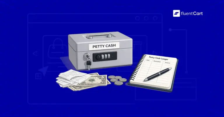
What Is Petty Cash? Examples, Uses, and Smarter Alternatives
Learn what petty cash is, how the imprest system works, how to record and reconcile it, and whether…
-
What Is Order Management? (And Why It Gets Messy Fast) [Guide]
Order management is the process of order capturing, tracking, and fulfilling customer orders. The order management process begins…
-
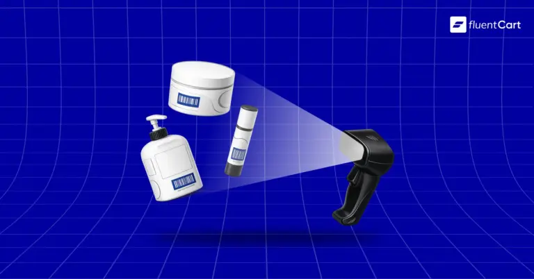
SKU: Definition, Examples, and How to Use It for Your Store
Learn what SKU means, how stock keeping units work, and how to create SKU codes for your ecommerce…


Leave a Reply