
What I Ask My Store Every Morning (Before My Coffee Gets Cold)
Hi, I’m Jewel, founder of WPManageNinja. We build FluentCart, FluentCRM, and the rest of the Fluent plugins.
I have a small confession. Of everything we’ve shipped in FluentCart, the feature I personally use the most is the MCP. It’s the first thing I open every morning, before email, before Slack. And I’ve noticed most store owners still haven’t tried it.
So this isn’t a launch post. The MCP shipped back in FluentCart 1.4.1. This is me showing you how I actually use it on my own store, question by question, so you can steal the routine.
If you haven’t heard of MCP: it’s an open standard that lets an AI assistant like Claude connect to a real system. FluentCart ships an MCP server built in. Connect it once, and your assistant can read your orders, customers, products, subscriptions, and every report the dashboard can produce, straight from your live database. You ask in plain English. It answers with your real numbers.
That’s the whole technical explanation. The rest of this post is questions and answers.
One note before we start: my store’s real figures stay private, so every number, geo-locations and chart below is illustrative. But the questions are the exact ones I ask, and the answers come back exactly in this shape.
The first thing I ask every morning
“How are sales doing over the last 30 days compared to the period before?”
| Metric | Last 30 days | Prior 30 days | Change |
|---|---|---|---|
| Gross revenue | $84,320 | $71,900 | +17.3% |
| Net revenue | $80,100 | $68,400 | +17.1% |
| Paid orders | 612 | 560 | +9.3% |
| Unique customers | 540 | 502 | +7.6% |
| Average order value | $137.78 | $128.40 | +7.3% |
One glance tells me revenue is up 17%, and that it’s healthy growth: orders rose 9%, and each order got 7% bigger. I’m not just selling more, I’m selling better. This used to be three separate report views and some mental math. I also ask about the last 24 hours’ sales activity. Now I read it before my coffee is done.
When a number looks odd, I chase it
Some mornings the number is strange, in a good or bad way. So I ask for the shape of it:
“Show me daily revenue for the last 30 days.”
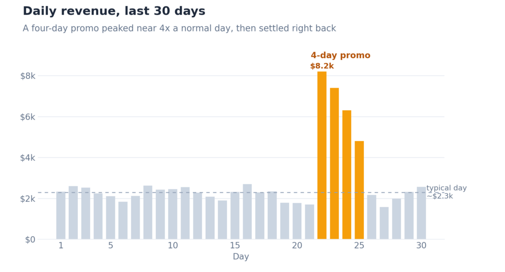
There it is: a four-day spike peaking near four times a normal day. That was our promo. So I keep pulling:
“Break down the spike-day orders by campaign.”
| Campaign | Orders | Revenue |
|---|---|---|
| spring-refresh | 96 | $12,400 |
| youtube-tutorial | 34 | $6,800 |
| newsletter-june | 41 | $5,900 |
| product-hunt | 18 | $2,100 |
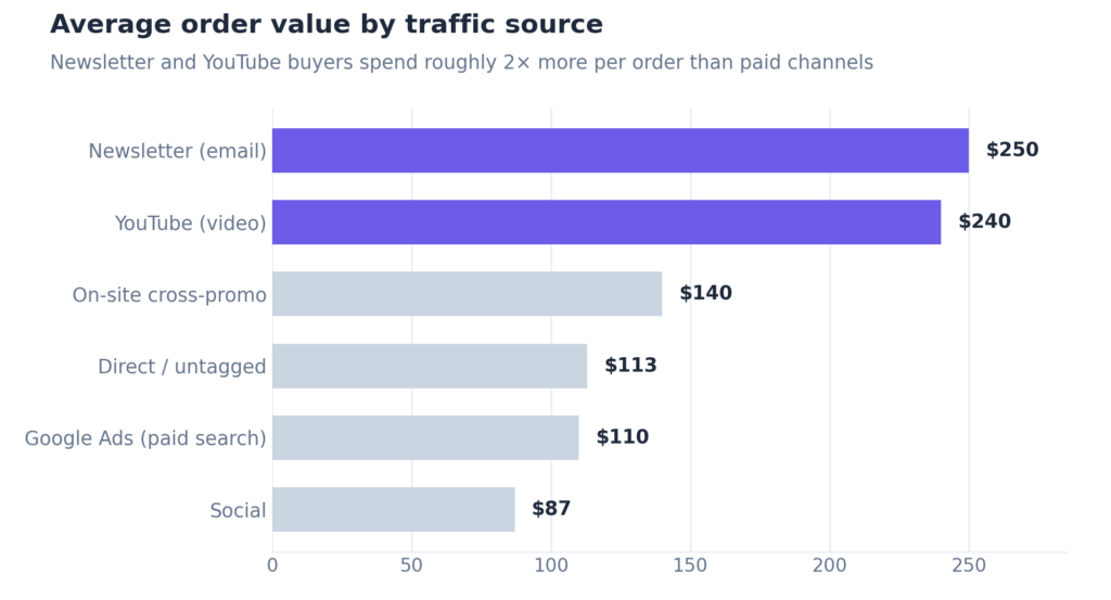
Now I have the story. The promo drove the volume, but look at the YouTube tutorial: fewer orders than the newsletter, more revenue. Those buyers spend more per order. That tells me where my next marketing hour goes, and I got there in two follow-up questions, zero spreadsheets. Chasing a hunch used to cost me twenty minutes. Now it costs twenty seconds, so I actually do it.
“Break down last month’s orders by traffic source: orders, revenue, and average order value.”
| Source | Orders | Revenue | Avg order value |
|---|---|---|---|
| Direct / untagged | 300 | $34,000 | $113 |
| Newsletter (email) | 65 | $16,250 | $250 |
| YouTube (video) | 42 | $10,080 | $240 |
| On-site cross-promo | 90 | $12,600 | $140 |
| Google Ads (paid search) | 60 | $6,600 | $110 |
| Social | 55 | $4,790 | $87 |
How I earn, not just how much
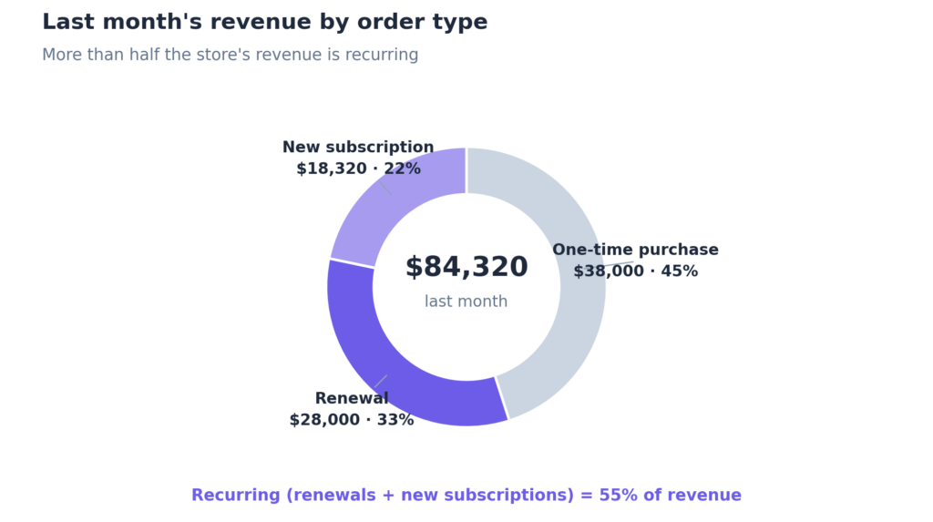
“Split last month’s revenue by order type.”
| Order type | Orders | Revenue | Avg order value |
|---|---|---|---|
| One-time purchase | 280 | $38,000 | $135.71 |
| Renewal | 240 | $28,000 | $116.67 |
| New subscription | 92 | $18,320 | $199.13 |
Three rows, whole strategy. More than half my revenue is recurring. Renewals bring in $28,000 on autopilot from customers who bought long ago and stayed. And new subscriptions carry the highest order value, so every signup is worth the most up front. When someone asks me “how’s the business,” this table is the real answer.
Money that hasn’t arrived yet
Most reports look backward. This is the one I check when I think about cash:
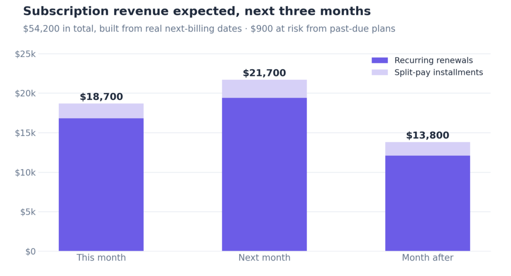
“How much subscription revenue is expected over the next three months, and how much is at risk?”
$54,200 expected across roughly 1,300 upcoming charges, with $900 at risk from past-due plans.
| Period | Recurring renewals | Split-pay installments | Total expected |
|---|---|---|---|
| This month | $16,800 | $1,900 | $18,700 |
| Next month | $19,400 | $2,300 | $21,700 |
| Month after | $12,100 | $1,700 | $13,800 |
That’s a cash-flow forecast built from my real next-billing dates, the kind of thing I’d spend hours to make it. It keeps finite split-pay plans separate from open-ended renewals, and the “at risk” figure uses my store’s own renewal success history.
Catching churn the week it happens
Quiet cancellations are what kill a subscription business, so I never skip this one:
“How many subscriptions were canceled in the last 30 days, and what were they worth?”
44 subscriptions canceled, representing $2,100 in recurring value per cycle that has now stopped.
Then: “List the highest-value ones so I can reach out.” It returns them sorted by recurring total, customer on each row. Instead of discovering churn in a quarterly review three months late, I catch it the week it happens.
Where my margin leaks
“For each product last month, show units sold, revenue, and how much I gave away in discounts.”
| Product | Units | Revenue | Discount given |
|---|---|---|---|
| Studio Pro | 265 | $28,600 | $5,400 |
| Template Vault | 190 | $19,400 | $2,100 |
| Mega Icon Pack | 160 | $12,300 | $1,900 |
| Certification Program | 22 | $9,800 | $600 |
My bestseller gave away $5,400 in a single month. Maybe that’s deliberate. Maybe not. Then a quick follow-up: “which coupons are used most?”
Launch week
When we ship something new, I live in this question for the first seven days:
“Give me the full financial picture for [the new product].”
- $20,400 collected so far: $18,000 from 120 one-time purchases, plus $2,400 from the first installments of 40 split-pay plans.
- Those 40 plans commit $9,600 in total, so $7,200 is still scheduled to arrive.
- Total locked in: $27,600. That’s cash in the bank plus commitments on the books.
- Just $150 refunded so far. Buyers are keeping it.
That’s the launch scorecard that actually matters: not just “how much did we make,” but “how much have we locked in.” Money collected and money contractually owed stay separate, a distinction most dashboards blur into one confusing figure.
Knowing my customers
“Who are my ten highest lifetime-value customers?”
It returns them ranked, and the patterns are more useful than the ranking. An agency worth $4,200 across just 6 orders, about $700 each, clearly buying team licenses. A solo creator worth $2,900 across 34 small, frequent orders. Two completely different paths to the same VIP tier, and each deserves a different kind of thank-you.
Then the one that reframed my growth plans:
“Break down customers and their lifetime value by country.”
| Country | Customers | Avg lifetime value |
|---|---|---|
| United States | 4,100 | $118 |
| Germany | 420 | $210 |
| United Kingdom | 380 | $190 |
| Canada | 260 | $205 |
| Australia | 240 | $198 |
| Netherlands | 180 | $224 |
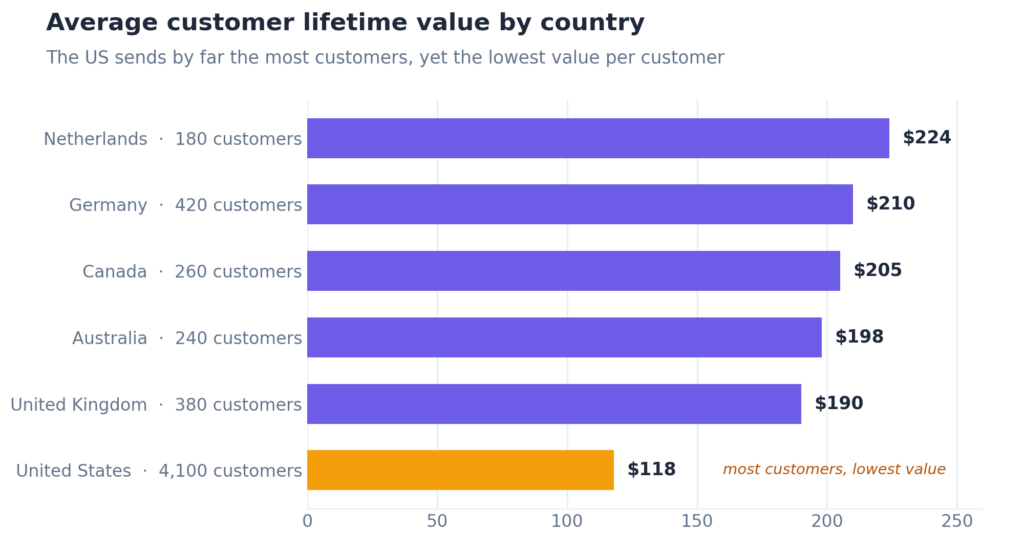
The US sends by far the most customers, yet has the lowest per-customer value of every major market. German, Dutch, Canadian, and Australian customers are each worth nearly twice as much. I’d been planning my next quarter around US-focused campaigns. This table made me rethink the whole thing.
The boring errands it runs for my team
Not everything is big-picture. These are the everyday ones my team leans on:
- “Show me any orders stuck in processing or with a failed payment.” The follow-up list (a payment to retry, a license to re-send) built in a second, so nothing sits half-finished.
- “Pull up everything about order #1032: transactions, refunds, the customer, their subscription.” A full case file for support, without clicking through five screens.
- “What’s my refund situation this month?” Comes back as one line: 22 orders refunded, 3.6% of paid orders, $2,850 total, $129 average. I ask every Monday, so a rising trend gets spotted the week it starts.
Prompts worth stealing
Where I’d start, depending on what you do:
If you run the business:
- “Give me a Monday-morning briefing: revenue versus last week, refund rate, cancellations, and anything that looks off.”
- “Which of my products grew fastest this quarter, and which stalled?”
- “How much recurring revenue is locked in for next quarter?”
If you do the marketing:
- “Which traffic source has the highest average order value?”
- “Did the last promotion beat the baseline, or just pull sales forward?”
- “Which countries have high lifetime value but few customers? That’s my expansion list.”
If you own the numbers:
- “Reconcile last month: gross, net, refunds, and the split between one-time and recurring.”
- “Forecast subscription cash for the next 90 days, and flag anything at risk.”
None of these needed a report to exist in advance. If the data is in your store, you can ask for it in the exact shape you think about it. That’s the real unlock. I’ve stopped building custom reports. I just ask.
Is it safe to point an AI at a live store?
Fair question. I wouldn’t use this daily on my own store if I didn’t trust how we built it.
- It signs in as you. The connection uses a WordPress application password tied to a real user account, so it can only see and do what that account’s role allows. Connect a staff account, and it inherits exactly that staff account’s limits.
- Money actions preview first. Sensitive writes like refunds or cancellations run a dry-run showing exactly what will happen before anything is committed.
- It computes, it doesn’t guess. Every figure runs through the same logic as your admin reports. Amounts come back in exact cents, and it refuses to blend different currencies into one misleading total.
- It tells you what it skipped. If your role can’t access something, it says so instead of quietly handing you an incomplete picture.
Set it up in five minutes
- Update. You need WordPress 6.9+ (the MCP runs on the Abilities API in core) and FluentCart 1.4.1 or later.
- Enable the MCP module in FluentCart settings.
- Create an application password and paste the generated connection snippet into Claude Desktop, Cursor, or any MCP-compatible client.
- Ask your first question. Try “Give me a snapshot of my store” and go from there.
The full walkthrough with screenshots is in our documentation.
Why it’s my favorite
To me, this is the difference between having data and having a data analyst. Between a dashboard I remember to check and a colleague I can just talk to. Between wondering how last week went, and knowing in ten seconds, along with the why.
We’ve built a lot into FluentCart that I’m proud of. This is the piece I actually use every single day. Connect it once, ask your store one real question, and I think you’ll see why.

I’m Jewel, founder of FluentCart and CEO at WPManageNinja, the team behind Fluent Forms, Fluent CRM, Fluent Support, FluentLogs and a handful of other WordPress plugins. I have been writing WordPress code since 2009 and still think of myself as a developer first and an entrepreneur second. Most of what I write on this blog comes from arguments we have had inside the team about how to build software people can actually depend on.

Subscribe now
Related Articles and Topics
-

eCommerce Laws in 2026: The 8 Rules Regulators Are Fining Stores Over
The 8 ecommerce laws regulators fined stores over in 2025 and 2026.
-

What Is a Payment Gateway? A Guide for WordPress Store Owners
Confused about payment gateways? Here’s what they actually do, which ones fit WordPress, and how to pick the…
-

GiveWP Alternatives: What Actually Replaces It
GiveWP’s future is shaky. Here’s what real GiveWP alternatives do better in donation-taking operations, and where they still…




Add your first comment to this post